Tuesday 30 December 2014

Second Draft of my double page spread


As I said previously, I wanted my second double page spread to be completely different so that I had a range of different styles and layouts to choose from and decide which I preferred the most. I think this double page spread went well ,as its very basic and plain which is exactly the look that I wanted to achieve. I once again kept to a colour scheme, however this time instead of my typical black white and red, I used black white blue and deep purple. The reason I decided on this was because Ellie had no background behind her image, so I thought this gave me the opportunity to use her outfit colours to contrast with the text. This also gave it a professional and edgy look which I liked a lot.

I wanted to continue giving my magazine identity, so therefore I kept the title of the magazine in the right top hand corner of the page along with the subtitle underneath. I also positioned the text 'ELLIE GOULDING' rather largely on the page so it drew the readers attention and straight away made them aware of who and what the interview was about.

I enjoyed creating these drafts and felt they all went pretty successful, as it gave me a lot of new ideas and skills which I can use to create my real magazine.

Draft of my Double Page Spread


This is my first attempt at creating a double page spread. I chose to do an interview, as when researching other double page spreads, I found this was most common. My article was on the artist 'Ellie Goulding', as I thought she is quite a well known artist in which my target audience would find interesting. I chose questions specific to the topic of music from how she started her career to how she got herself where she is now.

I decided to continue using basic colours of black white and red as these contrast well with the image as the colours used for the image are very gentle and subtle. Also keeping the similar trend of colours would give my magazine a noticeable house style which is what I wanted to have. I also kept a plain white background so that the text stood out. I chose the questions to be in bold to highlight importance and difference in narration. I also decided to use a big letter 'E' as I noticed this was familiar on the 'Q' magazine and I liked this idea a lot so wanted to try it out on my magazine which I think worked rather well. I coloured the 'E' in a light grey so that it stood out but also allowed the overlap of text from the interview be clearly readable.

I wanted my magazine to have identity throughout so by having the title on the top made people reading it recognise it straight away. For my second double page draft, I wanted to change the layout, so that I can include more interview and images, rather than just one page of interview and one page of an image.

Friday 19 December 2014

The User and Gratification


The User and Gratification Model
  • Power lies with the audience, not the producers
  • Theory emphasises what audiences do with media texts – how and why they use them
  • Audience is free to reject use and play with media meanings


Audience use media texts to gratify needs for:
  • Diversion
  • Escapism
  • Pleasure
  • Information
  • Relaxation
  • Sexual stimulation
 
Audience is in control and consumption of the media helps people with issues such as:
  • Learning
  • Emotional satisfaction
  • Relaxation
  • Help with issues of personal identity
  • Help with issues of social identity
  • Help with issues of aggression and violence
 
 
INDIE-POP
Indie-Pop is a genre of Alternative Rock, It's a very unique and independent music taste with differs from indie pop as it's more melodic, less abrasive and relatively angst-free.
People that are into the guitar, drums or keyboard would like this sort of music as them type of instruments are commonly used in this genre.

Tuesday 16 December 2014

Draft of my magazine


This is a draft of what I want my magazine to look like. Having a rough outline will make it easier for me when creating the real thing. My chosen genre is 'indie pop', therefore I had to choose a suitable name title which was relatable. I thought that including the genre in the title would make the magazine more recognisable, which is why I am going to call it 'IPM' which stands for 'indie pop music', I am going to be using that as my slogan/sub heading so people know what the name represents. I also want the title to appear behind the main image so it looks more professional, however with this chosen image, it was hard to create this effect, however I will attempt to do this on my real front cover.

I chose the colour red as it goes well with Ellie Goulding and stands out against her. I went for black and white text for the rest of the magazine as I think these colours are suitable and readable for the audience. I put some of the sell lines in the same colour as the title so it made it stand out and contrast well. I purposely put Ellie Goulding's name on the cover and a snippet of her interview to portray her importance of being on the front cover.

The image I used for this mock up is taken from Google, however my final image will be taken myself. I think the image I chose was a good replica of where I want text and heading o be positioned, however I'm glad I've had the chance to create a draft, as the image I chose originally is different to the image I would have preferred, as I would like to have the model looking directly into the camera rather than closing her eyes, so that the audience feel more involved. On the other hand, I like the centre mid shot as this allows their to be information placed around the image which gives the cover structure as well as drawing the readers attention straight to the middle of the page, which is exactly what I aim to do.

Tuesday 9 December 2014

Original Photos

I finally decided to take my photo's outdoors in the countryside near where I live, as we've been fortunate enough to have lovely weather this time of year.

My model is Megan Beth Gilbride and in order for her to fit the part in an indie-pop magazine, I decided to dress her in two different outfits. The first outfit consist of a pair of sunflower dungarees, over a plain white top, tights, brogues and a hat. This outfit gave her a very causal look which is perfect for me genre, as indie-pop is all about an effortless style. The second look was a little more dressy, as she is wearing  a skirt, jumper, tights, brogues, bag and a hat. I found both outfits fit the genre well, which is why in my magazine I am going to be using a mixture of both.

Below are some of the original photo's I took before being edited. Once edited, I will make a choice of which photo's I want for my front cover and double page spread.

The first look


The second look


Friday 5 December 2014

Inspiration For Front Cover


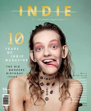
Both of these music magazine front covers inspired me in order to create my final piece. Q music magazine cover most genres of music including indie pop, which I why I could relate to this. I prefer how the Q magazine has lots of features on it which makes it look very busy, allowing the reader to become occupied throughout the magazine. On the other hand, the music magazine INDIE is very minimal, which creates that vintage look and portrays the genre very well. I also like how both magazine have used a house style to keep the magazine structures and well presented. For example, Q have used red white & black, whereas 'indie' have used yellow, green and black & white.

Although, I dislike how the masthead does not contast with the background and instead blends in, this does not make the mashead stand out in order to gain the readers attention. Therefore I will combine the different features from both music magazines to fullfill the readers satisfaction, by having the very vintage and retro look but by also having many features such as a bold masthead, sell lines, images and many more to create the right indie rock music magazine that will be best suited for my target audience.


I had a go at creating an indie pop music magazine using a well known artist in the genre such as Ellie Goulding. The image is almost a full length shot just cutting off the bottom part of her leg and feet. Ellie Goulding is a huge well known international artist, and has had many song releases in the charts. She is also an artist everyone will recognise as soon as they look at the front cover. I have got the image just above the model as the word is too short to place behind the models head, however if I made the mast head bigger this may have been able to work. One thing I would alter or add if I did it again would be inserting smaller images next to the text. These will help draw the readers attention to that certain part of the front cover which would then make them want to read more about the article and make them engage more. I have also used different sized fonts. The bigger the font the more attention that certain section of information is going to get. For example "Ellie Goulding Exclusive Interview" is in a big font which engages the reader, therefore, they will read further. The masthead is also in a big, bold, sans serif font at the top, this is there as it will be one of the first things the reader looks a. I have also used colours that contrast with the background, so white's and reds against the dull background to make it stand out.
I also created this music magazine front cover on publisher as I found this was a really easy yet effective way of creating a quick mock up. I started off with a plain, almost full length photo of Ellie Goulding with lots of free space around her to add short snippets and the masthead. I added the masthead in a sans serif, white font that contrasts with the background to make it stand out more. Lastly, I added the short snippets of information around the sides of the main image to finish my front cover.

Audience Feedback

Since this is just a mock up of what my actual music magazine front cover will look like, I thought I would make a questionnaire to help me get an idea of the different sections I need to focus and improve on to succeed in fulfilling my target audiences needs.

Leah Davis (aged 17):

1. What genre would you say this music magazine is?
Indie pop

2. What do you like about it?
How there is a noticeable colour scheme which makes the magazine seem professional and organised.

3. What would you change about it?
Perhaps putting the mast head behind the model instead of above her.


Gemma Vhaughn (aged 16):

1. What genre would you say this music magazine is?
Pop/ Indie pop

2. What do you like about it?
I like how the text on the magazine positioned around the model so it fits in nicely.

3. What would you change about it?
Maybe place the model on a white background so that the text can stand out more clear.

 
Anna Lee (aged 17):

1. What genre would you say this music magazine is?
Indie Pop

2. What do you like about it?
I like how it's all set out and the way the more alluring snippets of information are in a bright red white professional looking sans serif font. I also like how the definition of the mast title has been placed directly opposite underneath the model.

3. What would you change about it?
Nothing.

 Overall, once I have taken my final photos, I will proceed to make my music magazine front cover including the feedback I have gotten from my target audience to fulfil majority of my target audience's needs. 

Friday 28 November 2014

Questionnaire of my magazine

Questionnaire In order for me to produce a good magazine, I need to gather opinions from my target audience in order to collate feedback to help improve. I have asked a series of questions so that I can adapt their opinions into making my magazine more likeable. The questions I have asked below are a range of their own preferences towards other magazines and their view/opinion on the look and style of my prototype magazine.


1. What gender are you?
Leah- female
Daniella- female
Fran- female
Ana - female
Ethan- male


2. How often do you by Magazines?
Leah- not very often
Daniella- monthly
Fran- monthly
Ethan- varies, sometimes I'll get one every week, but then other times I may not bother
Ana- I subscribe to a magazine monthly


3. Do you like the house style of the magazine?
Leah- yes

Daniella- yes
Fran- yes
Ethan- yes
Ana- yes


4. Do you like the magazine name?
Leah- yes
Daniella- yes
Fran- yes
Ethan- yes
Ana- yes, I like it as it's short which will make readers remember it.

5. How can I improve the front cover main image?
Leah- have a sub title so that readers know what your magazine title stands for.
Daniella- I would try and position the title behind the magazine.
Fran- you should focus on making the writing around the image stand out against the background.
Ethan- make sure the photo is related to the genre.
Ana- I would experiment with the housestyle/colour of the magazine to make sure it is right, as you may use another style which goes better with the image.

6. What else can I add to make my magazine have a more professional edge?
Leah- keeping to standard colours rather than anything overly vibrant.
Daniella- make the title big and bold so that it stands out.
Fran- position the title behind the model in order to make the model stand out.
Ethan- try and range of serif fonts and sans serif fonts to make sure the one you are using is correct, as the writing is the most important part of the magazine as it's the main reason people buy the magazine.
Ana- stay away from the edge of the magazine as more white space make thing magazine look more professional, and it saves the worry of any text of image being cut off the sides.

7. What do you like most about it?
Leah- I think the images you chose were good.
Daniella- I like how you have stuck to one or two fonts maximum, which makes the magazine look more professional and legible to read. Also this makes it look less clustered which gives it structure.
Fran- your genre 'indie-pop' is well portrayed in your magazine.
Ethan- the colours you have chosen are simplistic which makes it clear and readable.
Ana- I like the image as the talent is someone well known which will appeal to most people.

Audience Pleasures

Audience pleasures are a set of techniques which a magazine will use in order to persuade their target audience to by their product and to maintain readership. Although the saying 'don't judge a book buy it's cover' is true, subconsciously we all do it, therefore overall looks are vital when producing a magazine as this is the first thing the audience visualises.

The magazine will use many different forms of direct address in order to persuade the reader. Some of these may include:

Information - the main content of this magazine is obviously music related, but I also need to make sure the information I put inside is going to appeal to the audience, for example I can include things such as tour dates, top charts and interviews which all hopefully entertain the readers.

Type of Language used - this is very important, especially when having a specific age group of readers. My magazine in particular is aimed at teens to mid twenties so therefore I want to use informal, colloquial language, as this will be familiar and allow the audience to relate to what I am saying. I will also include personal pronouns such as 'we' 'you' 'us', to make the readers feel inclusive and part of the music community.

Ritual pleasure of consuming the familar subscription - I have decided that my magazine will have a fortnightly subscription, meaning they won't have to wait too long for a new issue, but gives them a little wait which makes them excited to read whats too come. The reader having a subscription allows them to share the same recreation as other readers which may give them a sense of importance. It also gives them the opportunity of self definition, which means that the magazine will enable them to identify and develop their own character, personality and tastes/interests.

Other things which may influence a reader are the types of images used on the main cover and throughout the issue; free gifts and competitions, as these in particular engross the reader and make them enjoy what they are reading.

Monday 24 November 2014

Technology and Equipment I will use

When producing my magazine I will need to know what types of software I will be using, as well as the types of equipment so that it makes it easier when it comes to using it.

The types of software I will be using are google and youtube, as these will be great when it comes to researching. I will also be using publisher on a desktop computer to  help with creating mocks for my magazine.


Types of Equipment I will be using to research, plan and construct my magazine are a laptop/desktop computer or iMac depending on whats available and what programmes I need. I will also need a keyboard & mouse to input data. I'm going to be taking my photos with a Fuji-film camera from school to ensure I have the best quality resolution possible.


Risk Assessment

I have decided to take my photos in the school grounds as I am using a fellow student to model for the front cover of my music magazine. I must ensure the location where I am taking my photos are safe and not harmful to myself or the person I am taking photos of.

Being in the months of November/December, the weather has very lower temperatures, however for some photos my model will be wearing minimal clothing, so I will have to make sure my model doesn't get too cold whilst being outside for a short period of time.

If the weather is snowing or raining, then I will make alternative plans and take my photos inside and specifically the schools drama room. I would hope to take them on a plain white background, however this doesn't matter too much as I can always edit out the background afterwards. If this was too happen, I would have to check for dangers such as lighting and wires/cables which could be scattered on the floor, therefore I would need to move any of these hazards to the side before taking my photos.

Friday 21 November 2014

Socio Economic Grouping

Socio-economic grouping is a measure of an individuals social background, based on their occupation and employment status. There are 11 categories in which someone can be categorised.

Category A consists of people in the Upper Middle class, for example, land gentry, or large business owners etc. Next category is the Middle Class which comes under band B. These people have professional jobs or are high up in the army. The next two bands are the lower middle class which fall into bands C1 and C2. C1 are professional admin workers, whereas C2 represents the lower to skilled workers such as plumbers, carpenters, roofers. The last two bands are D and E. D is classed as 'working class' in which people work with no or little skill in their job (supermarket workers, cleaners etc.) The final band E, contains people who aren't employed or students that are either at college, school or university.

I personally feel that categorising people using this method is very unfair as it does not overlook the background or circumstances of someone's life, as well as their personality. This method only takes account for the persons job role, and doesn't think about economic situations such as a recession. Overall, I have come to a conclusion that I am not going to choose a specific band in which my audience should be in, as I feel a persons music interest does not depend on whether they own their own business or just go to school.

Monday 20 October 2014

Mass Media

Mass media is the various ways of how information reaches large groups of people through the methods shown below. This can be transferred through 'opinion leaders' who change the way someone thinks.
 
 
This image above very cleverly illustrates how one persons opinion about someone or something started off by an 'opinion leader' can spread to someone else in social contact with this person.
I think people should have their own opinion rather than listen/look and follow others, however this is easier said than done. Furthermore, this adds to the point of not following the crowd to fit in, as their opinions may not be right and you can't rely on someone else to think for you.
Another example of this is Social Media which is also influenced by the another persons opinion. Nowadays we are so caught up with celebrity lifestyle and our role models posting their daily events on sites such as Instagram, Blogger, Twitter, Facebook etc. The idea of being in direct contact through social media forces us to believe what these people are doing or saying is right and so naturally spread it. By sticking to your own opinion and not being influenced by others will help you to progress further in doing what you want to do, rather than what everyone else wants to do.

Friday 17 October 2014

Active vs. Passive Audience Theory

Active audience theory argues that media audiences do not just receive information passively but are actively involved with the text, often unconsciously. What they see are influences by factors such as family background, beliefs, values, culture, interests, experiences and education.

However, a passive audience does not actively engage with a media text. A passive audience is one that does not question the message that the media is sending and simply accepts the message in the way the media outlet intended. 
I would prefer my target audience to be active as they would be actively engaged and has their own individual view on the media texts and are influenced by cultures, interests, education or experiences... etc. However, I would like my target audience to be passive so they're not actively engaged with a media text and does not have question the media and simply accept it.
The Hypodermic Needle Theory developed in the 1930’s by researchers interested in explaining the effects of mass media consumption and propaganda in World War 1. This theory stated that all audience members reacted in the same way and how the audience were manipulated. For years the hypodermic syringe model was used to convince us that media could weald a terrible and dangerous influence over our lives.

 
In contrast to the Bullet/Hypodermic Needle Theory, the uses and Gratification theory assumes audience members are active. Developed in the 1940’s by Paul Lazarfeld, in response to growing criticism of the 2-D nature of the Bullet theory, claims that texts are open (to interpretation) and that consumers have power over the media, rather than the media having power over them. This 'bottom up' theory suggests that people are responsible for picking and choosing which media content they consume, and which way they may be influenced by it. Just as the name suggests, each person has the power to decide which media texts they will consume for their own self ‘gratification’ or satisfaction. An example of this is how many television programs are axed even after only a few screenings of episodes, if the ratings or circulation statistics are low. Therefore, society is in control of the media they consume. Audience members may stop consuming particular media texts by simply switching the television off etc. However, the flaw of this theory is that it assumes the media has little to no influence whatsoever on the individual.


 Different readings;
  • Preferred reading/dominant reading where it is the 'intended' reading of the text.
  • Oppositional reading where you dislike or disagree with the preferred reading.
  • Negotiated reading where you dislike and like different aspects.
  • Aberrant reading where you don't understand/misinterpret.

Therefore, when viewing the media you fall into one of these reading categories depending on your views and opinions on it. 

Denotation and Connotation

Connotation and Denotation are two principal methods of describing the meanings of words.

Connotation refers to the wide array of positive and negative associations that most words naturally carry with them, whereas denotation is the precise, literal definition of a word that might be found in a dictionary.
 
Examples;
Denotation;
- Blonde hair
Connotation;
- 'Dumb blonde, jealousy...


Denotation;
- House, home, residence all mean the same thing but all have different connotations.
Connotation;
- Home: cosy, loving, comfortable
- House: the actual building or structure
- Residence: cold, no feeling

Media Text Terminology

Print terms will help with the presentation of my music magazine as it will make it look very professional and sophisticated 
 
Below are a few examples of print terminology;
  • Primary
  • Secondary
  • Quantitative
  • Qualitative 
  • Serif
  • Sans serif
  • Lower case
  • Upper case
  • Sell lines
  • Masthead
  • House style
  • Mid shot
  • Long shot
  • Close up
  • Wide shot
  • Extreme close up

Advertorial- this is a type of advertising that is placed in a print publication. This sort of advertising appears like an editorial article.

Bleed- is a printing term that refers to printing that goes beyond the page, therefore being the area trimmed off. After trimming, the bleed ensures that no unprinted edges occur in the final trimmed product. Bleed will help me with producing my music magazine to make sure there are no errors of printing at the sides.


Strap line- this is a subsidiary heading or caption in a newspaper or magazine. It is something that needs to be short and easily remembered by an organization so that people can recognize it. This will be good for my magazine as it will hopefully make it stand out from other magazines.

Pass audience- when another person reads a magazine bought buy someone. This could be because it's been left on the side by another household member. Whether they are your target market or not, it adds to the number of people who have read that magazine.

Pug- this is normally situated in the corner of a magazine which looks like a sticker. They usually contain buzz words like 'win £100 of iTunes voucher' which try and persuade the audience to buy the magazine. As well as this, their may be short snippets of information to attract the reader to pick it up.

Tagline- is a small amount of text which serves to clarify a thought for, or designed with a form of, dramatic effect. Many tagline slogans are reiterated phrases associated with the readers interests such as 'exclusive'. This will help with my magazine when wanting to try and engage the reader into buying my magazine.


Gutter is a vertical margin of white space where two pages meet, it allows for bindings in the magazine. This will make my magazine look more professional and also neater and perhaps easier for the reader to read as the text in the middle will not be lost.

Allies are what separates the columns in a text. it will space out the writing making it easier for the reader to read which will make my magazine look neater yet more professional.


M.I.R.A is a way to approach analysis of media text;

M - Media form: What is this? 
E.g. a music video, movie, TV series, magazine, poster...
 
I - Institution: Who made this?
 
R - Representation: Who or what does this show?
E.g. is the representation positive or negative? Is it a stereotype or is it original?

 
A - Audience: Who is it aimed at?

 
M.I.R.A will help me with my magazine as when my audience ask questions I will know the important things about the magazine such as who made, what is shows and what it is.


Friday 10 October 2014

Mood board


I created an inspirational mood board for my genre of indie pop. I have incorporated different indie pop styles as well as artists such as Lorde, Bastille, Ellie Goulding, Florence and the Machine. There are many more indie pop artists which I haven't included, for example, Taylor Swift, The Kooks, M83, The Lumineers and Sia. I used examples of current magazines at the moment such as Q, INDIE, Rolling Stone, Spin and Fault, in order for me to show what I would like my magazine to look similar too. I have also included different fonts, most of them tend to be a big, bold, clear sans serif fonts which makes the text catch the readers eye. I will keep this in mind when creating my own music magazine as using a similar font may be beneficial for my magazine. Furthermore, I added images of certain instruments used in the indie pop genre such as guitars and drums, as this helps identify the genre of indie pop for those who don't know what it is. Creating this mood board has given me a whole range of different ideas for my future music magazine.

Friday 3 October 2014

Magazine Institutions

Magazine Publishers


Magazines are produced by institutions which are companies that produce, market and distribute texts. The two main music magazine publishers in the UK are Bauer and IPC Media.


Bauer Media Group is a multinational media company headquartered in Hamburg in Germany. Since the company was founded in 1875, it has been managed by four generations of the Bauer family. Originally a small printing house, The Bauer Publishing Group has grown into a worldwide publishing and media company. The Bauer Publishing Group comprises 300 magazines worldwide in 15 countries, as well as TV and radio stations. Bauer started in the UK with the launch of Bella magazine in 1987 and as H Bauer Publishing became Britain's third largest publisher, Bauer further expanded in the UK with the purchases of Emap Consumer media and Emap Radio in 2008 to then become the UK's biggest publishing group. Bauer media brands include; Kerrang! a rock music magazine which originally began as a magazine then later in 2004 Kerrang radio was launched. Also, Q was first published in 1986, setting itself apart from much of the other music press with monthly production and higher standards of photography and printing, with an emphasis on style. Lastly Mojo


IPC Media which stands for International Publishing Corporation Media was founded in 1958. IPC Media publishes music magazines such as NME a weekly pop/rock music magazine published in March 1952, also, Uncut, a monthly magazine that mainly focusses on music, but also includes film and books sections.


Independent Publishing Alternatives


If a magazine is likely to have a narrow, specialist appeal it may be published by an independent publisher.
Although the sales might be lower, the magazine producer can also focus on an area that would not be covered by major publishers.


Shindig! is an example of a independent publishing alternative. Not only does Shindig! focus on music, it covers art, fashion, architecture, film and TV. According to the latest survey, 82% of Shindig! readers are in the ABC1 category which shows it has a wide range of different people buying it, however, men make up 83% of the readership where women take up 17%.

Fonts

I have been looking at different fonts for my magazine front cover. I want my music magazine front cover to look very vintage and retro, and I think these fonts will make my front cover stand. I need a font that is eye catching but not too much to take away the focus off the other features which also appear on the front cover. After some consideration, I have chosen the 'limelight' font as it is very plain yet does not create a distraction from the rest of the features on the front cover. 


The name of my music magazine is going to be 'Indie-Rock', simple but effective as it clearly shows and tells the reader straight away the genre of my music magazine. Out of the twelve fonts I narrowed it down to, I wanted to see what they would look like at the masthead of my magazine, so I wrote 'Indie Rock'
in all of the twelve different fonts to then decide which one looked more effective.


After further looking at the different fonts, I decided that the big, bold fonts such as the 'Accent SF' font came across too gothy and in your face. Furthermore, this would draw the readers eyes away from the image and other features on the magazine front cover. 

Keeping in mind that I want my magazine to look vintage and retro I decided that the 'Stylistic SF' font did this for me. It is very plain and simple but it also catches the readers eye. On the other hand, it will stand out and it also won't take the focus off the other features. I wish to have the main image to overlap the masthead slightly to then draw attention to the main image and then further snippets of information on the front cover, this would be to then make the viewer want to buy it and read it.

Thursday 2 October 2014

Ideology

What is ideology?
a system of ideas and beliefs promoted by dominant groups to reinforce their power.


Ideology in Music Magazines
 
 
This is a rap Magazine called 'Vibe' I am going explain how the front cover fits the genre.
The image of T.I. fits the genre because the genre is portrayed as rap which connotes the thoughts of gangster and even depression,  so therefore this image fits the front cover because when you look at T.I. you see the serious look which gives off a slightly negative feeling, as well as the snapback he is wearing, associated with rap. Also the colour scheme of the magazine helps show the feeling of T.I as they've used red for the title which symbolises anger shown by his facial expression, as well as a dark blue background which suggests sincerity and gives an overall sombre feeling.


This is a pop magazine aimed at the younger generation and in particular, girls, shown by the use of the colours pink and light blue. They have used One Direction on the front cover which we all know are most young girls loved icons, therefore suiting the genre very well. I've noticed on these type of magazines, how a lot of the information on the cover is non related to music but more the gossip of celebrities, tips and clothing styles. As you can see they have female celebrities such as Tulisa and Fearne Cotton who young girls love as well half naked guys on the left bottom corner which once again helps with portraying the genre of this magazine.

 
Comparisons of the two magazines:
Both magazines use colour to attract their target audience and help portray the mood of their magazine. the first magazine wants to create a more adult mood and give a more serious feel to the magazine by usinging darker colours such as Dark blue and red, whereas the second magazine uses more girly and bright colours to portray a happier mood that suits the target audience of a younger age.
Layout is key on both magazine covers, the first magazine is more spacious and spread out with not many captions and only one picture of a well known famous icon, this has more of an adult appeal as the majority of adults are not interested in the gossip and rumours of celebrity relationships. However the second magazine is the complete opposite, as you can see it's a lot more cramped with images and captions of well known icons to fit with the genre and audience is wants to appeal to; this is more suited to a younge audience as they want a window into the lives of their favourite celebrity and they want to know the latest fashion trends and gossip.

Monday 29 September 2014

David Carson


David Carson was born September 8th, 1954. He was an American graphic designer and art director. He is best know for his innovative magazine design, and use of experimental typography. He was the art director for the magazine Ray Gun, in which he employed much of the typographic and layout style for which he is known. In particular, his widely imitate aesthetic defined the so-called "grunge typography"

The designs of David Carson are extreme compared to other magazines. Other magazines, such as Kerrang! and Q, all follow the usual design of a magazine (Masthead at the top, mid-shot of a person in the middle, snippets or sell lines of information down each side). 


David Carson however doesn't fit with this trend. Carson creates magazines that go against the trend and make people express an opinion because of this.

My opinion on his work is that it is original and almost abstract. Each issue is completely different, almost making it a one of a kind magazine for each issue. Carson doesn't stick to the rules when it comes to a magazine layout and this means you get a different look to the magazine every time.


Some of the things that Carson has made different about his magazines are:

That Carson hasn't put the masthead of 'Raygun' on every magazine. Magazines put the same masthead on the top of the magazine so buyers and readers can recognise the magazine. Carson, however, has put different titles at the top of some of his magazines, e.g. blue.

Another part of these magazines which make them different to typical magazines is that this person on the front of 'blue' is sideways with their face not being visible. This is different as a usual magazine contains on the front a mid-shot, long-shot or close up of the artist normally facing forwards.

Lastly, with 'blue' there are no snippets or sell lines down the side. This can make it difficult for readers when they want to know what's inside of the magazine and don't have time to flick through.

Overall, my opinion of David Carson's work on these magazines is that he has created a new genre of magazine, one that doesn't stick to the rules and therefore creates a creative and interesting magazine from the front. Even though a magazine like this wouldn't do so well when selling due to the layout of the magazine, I love the contrast 'Raygun' has to other magazines.