Wednesday, 4 February 2015

Evaluation 1: In what ways does your media product use, develop or challenge forms and conventions of real media product?


As you can see here, I based my main idea of my double page spread on the magazine Q. As I mentioned in previous posts, I love the layout of Q and how it has great structure yet it also very creative and minimal. Q magazine also helped me to design my front cover and contents page with it's layout of images and text.
I felt keeping a house style running throughout my magazine was important so
that the reader gets familiar with the magazine and can identify it on a shelf without having to read the mast head.
I have constructed my double page spread so that it follows similar conventions of a typical music magazine. In comparison to Q magazine, there is the main image of the artist/band on one side of the page, and then text in two columns on the other side. By following similar music magazines, gave me ideas and enabled me to pick up the typical conventions, therefore making it easier for me to design my own magazine. As you may of spotted immediately, Q magazine gave me the inspiration for using a large letter behind the text. If it wasn't obvious already, the letter represents the artists/bands first name which in this case, the 'M' represented 'Megan'. I felt this was quite a cool, edgy idea which fitted in with my independent genre, as well as reinforcing the importance of my artist. I also felt doing this gave plain, simple text a more fun and creative look, therefore making the audience want to read it. In the Q magazine demonstrated above, I noticed how there was some text on the image, which is why I thought it would be unique to input a quote next to the model, to reinforce the artists personality and give the audience something extra to read. This was one reason for positioning the quote here, but the second reason was due to me originally placing a smaller picture on the bottom left, meaning there was an empty space left on the other side of her. I felt placing the quote here would complete the double page spread and make everything intertwine very neatly.
When editing the photo I was very keen on sticking to the 'vintage' style theme as seen on the front cover and contents. As the images are very similar to each other, it wasn't too hard to maintain this. I also thought by sticking to the same fonts and colours would help me to achieve the look I wanted and make it look very structured and professional throughout the magazine.


As you can probably see from above, the magazine 'Q' had once again helped me to design the layout of my contents page. I noticed how 'Q' had stuck to their red white and black house style by highlighting the sub heading and page numbers in red, and then putting the rest of the text in black. I really liked this idea as I felt it looked really controlled and precise, which is why I used the models sweater to contrast with the page number and sub headings, creating a structured link of importance between the two. I found this also makes the contents page easier to read and navigate around. However, my contents page isn't exactly the same as 'Q' as I found there was quite a large amount of text on their contents which I wasn't keen on having, as I found this made the page look a little cramped and clustered, therefore I chose a few major headings and surrounded them by larger images, making the contents more boisterous.
As I felt that my magazine was slightly more bias for girls, I decided to add the image of a boy band... in this case it was 'arctic monkeys', as they were a familiar indie-rock band which both males and females admired in this genre of music.
I chose to continue using the colour burgundy so that it would create a flow throughout my magazine, as the colour was used on the front cover to highlight the mast head and topic headings, as well as being used on the double page spread when highlighting the page number and artists name.


Tuesday, 3 February 2015

END RESULTS


Front Cover

This is my final construction of how I wanted my magazine to be. As you can see, the name of the magazine is at the top of the magazine, however I had to position is slightly to the left. At first I had in mind that I wanted it to be centre, however after I placed the main image onto the cover, I noticed how Megan was placed more over to the right side. I found it looked more appealing to place the title on the left side of the model where there was more space. Like the rest of the magazine, I kept to the burgundy, black and white house style to keep to the professional look. I liked these colours as they weren't too 'in your face' which made it readable. I also made sure all the text was in capitals so that this gave the magazine structure and made is look very slick. This is the main idea of how I want my final magazine to look. 'Exclusive interview with queen of indie pop Megan Gilbride' was the main headline, so therefore I placed it in the smaller gap right of Megan so that the audience could relate to the picture and want to see more of what's inside of my magazine. I chose similar block writing with some small italics to give the page dimension. The reason I decided on this image is because it was full length body shot of Megan, which covered the length of the magazine. Furthermore, I liked her pose and how she was smiling slightly and looking directly at the camera which I found makes the audience feel involved and included with the magazine.


Monday, 2 February 2015

Double Page Spread


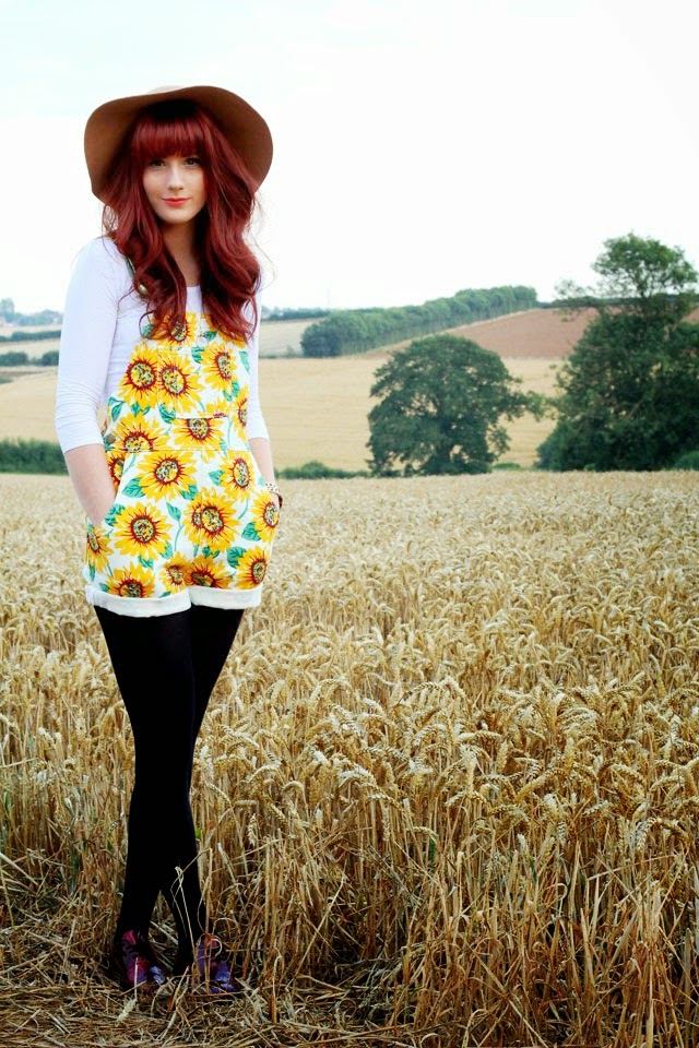
Choosing the photo for the double page spread was tough because there were a few different photo's that I thought worked really well. I done my research and found that the image of the double page spread can be less serious which is why I opted for picture where she is smiling and her pose is very relaxed. I specifically asked my model to wear something very creative and fun to give the impression that the interview is very light hearted and interesting.

 
I felt there wasn't any major editing which needed doing accept for adjusting the contrast a little, as I used a pretty good camera to take my photo's and was lucky that my setting had good weather and lighting. I added some writing onto the image which originally I wanted in the colour white. I found this colour made is hard to see due to the background so I stuck to black as it was legible. I placed the text next to the model so that it filled up the space and made it seem as if it was Megan who said the quote.


As I've mentioned previously, the magazine 'Q' has been my biggest inspiration and where I've got the majority of my ideas from. I noticed a lot of the double page spreads from 'Q' had the fist letter of the singers name displayed behind the text. I loved this idea and felt it would give the magazine a very modern, creative and professional look. Unlike 'Q' who had the letter in red, I preferred the coloured to be light grey so that the text would stand out more. As the magazine is about music, I wanted to keep the article music related, which is why I asked questions though out the interview such as "where does your inspiration come from when writing songs" etc. I kept the page number and the models name in the same burgundy colour to show a consistency link and house style throughout my magazine. I wanted to insert a picture of me and Megan in the bottom corner to make the interview seem more realistic, as I have seen some magazines do this and I thought it looks quite sleek.

Final Contents Page


This is my final contents page for my magazine 'IPM'. When creating the contents page, I knew I wanted something very simple, but effective, which is why I chose to stick to a specific colour scheme and follow the house style and layout of the magazine 'Q'. I chose the colour burgundy as the main colour, as it matched the models jumper which I thought made it look more professional. I contrasted this with the colours black and white as these are both very bold and neutral colours which didn't detract the attention away from the burgundy. I also found that these colours stood out and made sure the text was clear and easy to read which was most important. I positioned the title of the magazine 'IPM' in the top centre of the page as I felt it gave the contents page structure and hierarchy. I picked this larger body shot image of Megan as she is still looking directly into the camera, which gives the audience a sense of directness, but as her body is positioned to the side it makes the image look less important, therefore a reason why I didn't choose it for the front cover. Due to this being an indie pop music magazine, I chose not to include anything 'fashion' or 'beauty' related on the contents to exaggerated the genre and it's purpose. This is why I decided to include music related information such as 'tour dates', 'festivals' and 'top 10 chart list'. By also including a picture of the 'Arctic Monkeys', I felt this would make it more appealing to indie fans seeing their favourite band on the contents. Furthermore, I wanted to chose a male group to identify that this magazine is suitable for both genres.


Friday, 16 January 2015

Construction of my magazine

When researching how to construct a good magazine, I found the most important thing was the material on the cover as this is the first thing a reader is attracted to when they see it on the shop shelf. In my planning stage, I was very sure about who I wanted my talent to be, where my photo's were going to be taken and when they were going to be taken. Although I knew all this information, I wasn't sure what I wanted my model to be doing or what pictures I wanted to be on my cover and double page spread. I Learnt that this is the key factor in making a good magazine so that the pictures go with the genre. My photo's luckily turned out great, and because of my outfit planning, I never had an issue with the pictures not going with the genre so I am happy with how this went.

I originally chose the left photo below to be on my front cover....


BEFORE


 AFTER


 As I started putting the header and information on, I realized that due to the image being a close up and being taken horizontal, it was a lot harder to crop and reposition this image on the cover. I thought about getting rid of the background, however I wanted to keep the model being set in the country as this portrays an indie type vide. I was adamant about having this image so I tried everything from stretching, cropping, adjusting brightness and contrast, but I still couldn't find a  way of making it fit the page properly.


I then decided to use a similar picture but one which was shot further away so that I could make it fit the cover easier. I kept the model looking directly into the camera so show a serious look which engages the readers direct attention. My aim is to place the title of my magazine behind the models head, but in front of the background so that it makes the audience think and recognise my magazine overtime.


Friday, 2 January 2015

RECCE

Initially I had decided to take my photo's indoor, however I found that taking them outside was a lot more fitting for my type of magazine genre. I researched on Google where good places would be to take photos for a indie pop music magazine, however not a lot of feedback appeared, so decided keep it simple and unique. Most photos of models or celebrities in magazines are taken in a studio with the same plain white wall. I decided to be different and try the outdoors which actually suite my independent music genre.

I was lucky that I lived in the countryside which allowed me to have vast amount of field areas nearby which I could shoot my photo's at. I felt that the outdoors allowed my genre to be shown more clearly and went well with my models outfits. I felt the trees and outdoorsy setting coveys a very calm atmosphere which is good for my target audience, as this creates a positive ambience for my magazine.  
I feel that the natural colours and choose of location are appealing to both genders which means they can both enjoy the image. For example, if they model was stood in front of a pink, floral type background, this would be bias towards females.


Overall, I feel the areas in which I've chosen to take my photo's are conventional for the genre of my music magazine, for instance, it's very unique due to it not being on a plain white or coloured background like majority of magazines. Furthermore, I think this also makes my magazine look very well though out and professional.