Tuesday, 30 December 2014

Second Draft of my double page spread


As I said previously, I wanted my second double page spread to be completely different so that I had a range of different styles and layouts to choose from and decide which I preferred the most. I think this double page spread went well ,as its very basic and plain which is exactly the look that I wanted to achieve. I once again kept to a colour scheme, however this time instead of my typical black white and red, I used black white blue and deep purple. The reason I decided on this was because Ellie had no background behind her image, so I thought this gave me the opportunity to use her outfit colours to contrast with the text. This also gave it a professional and edgy look which I liked a lot.

I wanted to continue giving my magazine identity, so therefore I kept the title of the magazine in the right top hand corner of the page along with the subtitle underneath. I also positioned the text 'ELLIE GOULDING' rather largely on the page so it drew the readers attention and straight away made them aware of who and what the interview was about.

I enjoyed creating these drafts and felt they all went pretty successful, as it gave me a lot of new ideas and skills which I can use to create my real magazine.

Draft of my Double Page Spread


This is my first attempt at creating a double page spread. I chose to do an interview, as when researching other double page spreads, I found this was most common. My article was on the artist 'Ellie Goulding', as I thought she is quite a well known artist in which my target audience would find interesting. I chose questions specific to the topic of music from how she started her career to how she got herself where she is now.

I decided to continue using basic colours of black white and red as these contrast well with the image as the colours used for the image are very gentle and subtle. Also keeping the similar trend of colours would give my magazine a noticeable house style which is what I wanted to have. I also kept a plain white background so that the text stood out. I chose the questions to be in bold to highlight importance and difference in narration. I also decided to use a big letter 'E' as I noticed this was familiar on the 'Q' magazine and I liked this idea a lot so wanted to try it out on my magazine which I think worked rather well. I coloured the 'E' in a light grey so that it stood out but also allowed the overlap of text from the interview be clearly readable.

I wanted my magazine to have identity throughout so by having the title on the top made people reading it recognise it straight away. For my second double page draft, I wanted to change the layout, so that I can include more interview and images, rather than just one page of interview and one page of an image.

Friday, 19 December 2014

The User and Gratification


The User and Gratification Model
  • Power lies with the audience, not the producers
  • Theory emphasises what audiences do with media texts – how and why they use them
  • Audience is free to reject use and play with media meanings


Audience use media texts to gratify needs for:
  • Diversion
  • Escapism
  • Pleasure
  • Information
  • Relaxation
  • Sexual stimulation
 
Audience is in control and consumption of the media helps people with issues such as:
  • Learning
  • Emotional satisfaction
  • Relaxation
  • Help with issues of personal identity
  • Help with issues of social identity
  • Help with issues of aggression and violence
 
 
INDIE-POP
Indie-Pop is a genre of Alternative Rock, It's a very unique and independent music taste with differs from indie pop as it's more melodic, less abrasive and relatively angst-free.
People that are into the guitar, drums or keyboard would like this sort of music as them type of instruments are commonly used in this genre.

Tuesday, 16 December 2014

Draft of my magazine


This is a draft of what I want my magazine to look like. Having a rough outline will make it easier for me when creating the real thing. My chosen genre is 'indie pop', therefore I had to choose a suitable name title which was relatable. I thought that including the genre in the title would make the magazine more recognisable, which is why I am going to call it 'IPM' which stands for 'indie pop music', I am going to be using that as my slogan/sub heading so people know what the name represents. I also want the title to appear behind the main image so it looks more professional, however with this chosen image, it was hard to create this effect, however I will attempt to do this on my real front cover.

I chose the colour red as it goes well with Ellie Goulding and stands out against her. I went for black and white text for the rest of the magazine as I think these colours are suitable and readable for the audience. I put some of the sell lines in the same colour as the title so it made it stand out and contrast well. I purposely put Ellie Goulding's name on the cover and a snippet of her interview to portray her importance of being on the front cover.

The image I used for this mock up is taken from Google, however my final image will be taken myself. I think the image I chose was a good replica of where I want text and heading o be positioned, however I'm glad I've had the chance to create a draft, as the image I chose originally is different to the image I would have preferred, as I would like to have the model looking directly into the camera rather than closing her eyes, so that the audience feel more involved. On the other hand, I like the centre mid shot as this allows their to be information placed around the image which gives the cover structure as well as drawing the readers attention straight to the middle of the page, which is exactly what I aim to do.

Tuesday, 9 December 2014

Original Photos

I finally decided to take my photo's outdoors in the countryside near where I live, as we've been fortunate enough to have lovely weather this time of year.

My model is Megan Beth Gilbride and in order for her to fit the part in an indie-pop magazine, I decided to dress her in two different outfits. The first outfit consist of a pair of sunflower dungarees, over a plain white top, tights, brogues and a hat. This outfit gave her a very causal look which is perfect for me genre, as indie-pop is all about an effortless style. The second look was a little more dressy, as she is wearing  a skirt, jumper, tights, brogues, bag and a hat. I found both outfits fit the genre well, which is why in my magazine I am going to be using a mixture of both.

Below are some of the original photo's I took before being edited. Once edited, I will make a choice of which photo's I want for my front cover and double page spread.

The first look


The second look


Friday, 5 December 2014

Inspiration For Front Cover


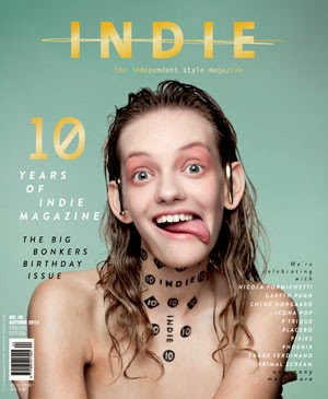
Both of these music magazine front covers inspired me in order to create my final piece. Q music magazine cover most genres of music including indie pop, which I why I could relate to this. I prefer how the Q magazine has lots of features on it which makes it look very busy, allowing the reader to become occupied throughout the magazine. On the other hand, the music magazine INDIE is very minimal, which creates that vintage look and portrays the genre very well. I also like how both magazine have used a house style to keep the magazine structures and well presented. For example, Q have used red white & black, whereas 'indie' have used yellow, green and black & white.

Although, I dislike how the masthead does not contast with the background and instead blends in, this does not make the mashead stand out in order to gain the readers attention. Therefore I will combine the different features from both music magazines to fullfill the readers satisfaction, by having the very vintage and retro look but by also having many features such as a bold masthead, sell lines, images and many more to create the right indie rock music magazine that will be best suited for my target audience.


I had a go at creating an indie pop music magazine using a well known artist in the genre such as Ellie Goulding. The image is almost a full length shot just cutting off the bottom part of her leg and feet. Ellie Goulding is a huge well known international artist, and has had many song releases in the charts. She is also an artist everyone will recognise as soon as they look at the front cover. I have got the image just above the model as the word is too short to place behind the models head, however if I made the mast head bigger this may have been able to work. One thing I would alter or add if I did it again would be inserting smaller images next to the text. These will help draw the readers attention to that certain part of the front cover which would then make them want to read more about the article and make them engage more. I have also used different sized fonts. The bigger the font the more attention that certain section of information is going to get. For example "Ellie Goulding Exclusive Interview" is in a big font which engages the reader, therefore, they will read further. The masthead is also in a big, bold, sans serif font at the top, this is there as it will be one of the first things the reader looks a. I have also used colours that contrast with the background, so white's and reds against the dull background to make it stand out.
I also created this music magazine front cover on publisher as I found this was a really easy yet effective way of creating a quick mock up. I started off with a plain, almost full length photo of Ellie Goulding with lots of free space around her to add short snippets and the masthead. I added the masthead in a sans serif, white font that contrasts with the background to make it stand out more. Lastly, I added the short snippets of information around the sides of the main image to finish my front cover.

Audience Feedback

Since this is just a mock up of what my actual music magazine front cover will look like, I thought I would make a questionnaire to help me get an idea of the different sections I need to focus and improve on to succeed in fulfilling my target audiences needs.

Leah Davis (aged 17):

1. What genre would you say this music magazine is?
Indie pop

2. What do you like about it?
How there is a noticeable colour scheme which makes the magazine seem professional and organised.

3. What would you change about it?
Perhaps putting the mast head behind the model instead of above her.


Gemma Vhaughn (aged 16):

1. What genre would you say this music magazine is?
Pop/ Indie pop

2. What do you like about it?
I like how the text on the magazine positioned around the model so it fits in nicely.

3. What would you change about it?
Maybe place the model on a white background so that the text can stand out more clear.

 
Anna Lee (aged 17):

1. What genre would you say this music magazine is?
Indie Pop

2. What do you like about it?
I like how it's all set out and the way the more alluring snippets of information are in a bright red white professional looking sans serif font. I also like how the definition of the mast title has been placed directly opposite underneath the model.

3. What would you change about it?
Nothing.

 Overall, once I have taken my final photos, I will proceed to make my music magazine front cover including the feedback I have gotten from my target audience to fulfil majority of my target audience's needs.