There would be no point in constructing a magazine, if you don't know how to attract your target audience into buying it, which is why everything you do, you need to think about 'how is this going to attract my target audience?'. You need to make sure everything in your magazine relates to your genre and audience. For example if a pop magazine, typically loaded with images of 'One Direction' or 'The Vamps', suddenly decide to put a heavy metal rock band on the cover, then this would not attract their audience. After deciding that my target market will be people who share a love for indie pop music, it was then important to plan elements that will attract them and engage them into buying my magazine.
One technique I remember being spoken about in class is mode of address. This is where the magazine engages with the audience to make them feel involved in what they're are reading. There are four types of mode of address which include the 1st person, the 3rd person, informal & formal and colloquial & expletive language. In my magazine I thought it was vital to use topic specific words in order to engage to my indie pop audience. In order to do this I needed to use a variety of colloquial & expletive language. I felt because the ages are 15- mid 20's they are relatively young. This in mind, I wanted to make my magazine appeal to the younger generation my using more 'slang' words rather than the Queens English. This was also important to consider in my interview with 'Megan Beth Gilbride'. As she was the artist on my front cover I wanted to write about her and her success in music. I used the quote ' good music doesn't have an expiration date', because I thought this would reach out to my audience and engage them to want to read the article, plus it's a straight forward quote in which everyone can understand.
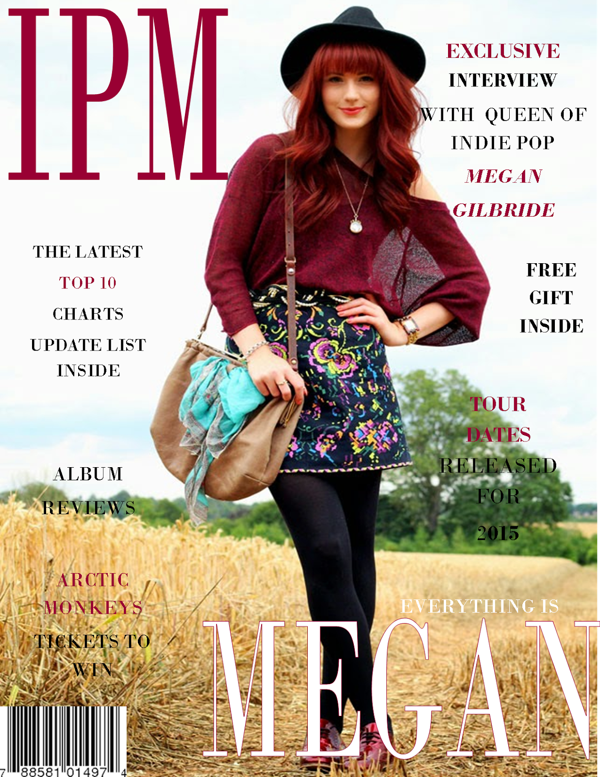
The images I used were another way to engage with my audience. On the front cover I had my model stand in relaxed pose, looking directly at the camera as I felt this builds the relationship between the magazine and the target audience. On the contents page I added an image of the boy band 'arctic monkey's' because I thought that my magazine front cover didn't portray that it was targeted to both genders, plus the band I chose was also into the indie genre. I feel that my model on the front cover appeals to the ages of my target audience as she is 24. I chose someone slightly older than the majority reading, as most young people have role models older than themselves which is why I felt she would be perfect for my magazine. On my double page spread I kept the model in a different relaxed pose. She has been dressed in more bright colours to reinforce her personality, furthermore the connotations of her smiling enhance the fact she may be a kind and gentle person.
When creating my magazine I had to think hard about a Mast head. I came up with a range of indie related words such as 'independent' and 'unique', however I didn't feel like these words were right for my magazine as I wanted something short and memorable.
The fonts were also really important when addressing my audience. I learnt that there are two types of fronts. SERIF and SANS SERIF. For my magazine I used Sans Serif front as I thought this looked a lot clearer and complied with my target audience. I felt that using Sans Serif made my magazine look less formal giving it that indie vibe.
Another way I engaged my audience was through the contents page. I made sure that the contents page was eye catching to the reader as it is the first page inside the magazine that my audience would see. I kept this page extremely basic by only including 2 images. The text in the context was also very minimal as I wanted the audience to read a little and then feel reluctant to read on inside. Although my main article was focused on Megan Gilbride, I also included other artists such as 'Arctic Monkey's' alongside a photo of them.
I feel like if I could re do anything to improve my magazine, I would firstly add more images regarding other artists as I feel that's one area I lacked on. I would also change the way my model was positioned in the double page spread and have her sitting down to make her seem more casual. However, overall I am really happy with my magazine as whole and feel it related well to my chosen target audience.


I feel like if I could re do anything to improve my magazine, I would firstly add more images regarding other artists as I feel that's one area I lacked on. I would also change the way my model was positioned in the double page spread and have her sitting down to make her seem more casual. However, overall I am really happy with my magazine as whole and feel it related well to my chosen target audience.
No comments:
Post a Comment