When researching how to construct a good magazine, I found the most important thing was the material on the cover as this is the first thing a reader is attracted to when they see it on the shop shelf. In my planning stage, I was very sure about who I wanted my talent to be, where my photo's were going to be taken and when they were going to be taken. Although I knew all this information, I wasn't sure what I wanted my model to be doing or what pictures I wanted to be on my cover and double page spread. I Learnt that this is the key factor in making a good magazine so that the pictures go with the genre. My photo's luckily turned out great, and because of my outfit planning, I never had an issue with the pictures not going with the genre so I am happy with how this went.
I originally chose the left photo below to be on my front cover....
BEFORE
AFTER
As I started putting the header and information on, I realized that due to the image being a close up and being taken horizontal, it was a lot harder to crop and reposition this image on the cover. I thought about getting rid of the background, however I wanted to keep the model being set in the country as this portrays an indie type vide. I was adamant about having this image so I tried everything from stretching, cropping, adjusting brightness and contrast, but I still couldn't find a way of making it fit the page properly.
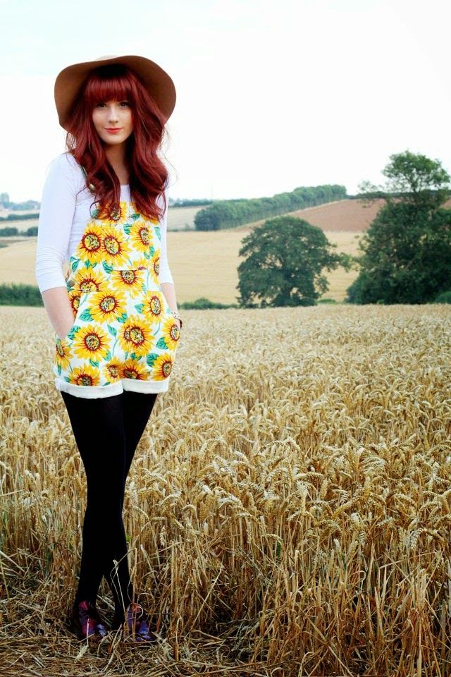
 I then decided to use a similar picture but one which was shot further away so that I could make it fit the cover easier. I kept the model looking directly into the camera so show a serious look which engages the readers direct attention. My aim is to place the title of my magazine behind the models head, but in front of the background so that it makes the audience think and recognise my magazine overtime.

Initially I had decided to take my photo's indoor, however I found that taking them outside was a lot more fitting for my type of magazine genre. I researched on Google where good places would be to take photos for a indie pop music magazine, however not a lot of feedback appeared, so decided keep it simple and unique. Most photos of models or celebrities in magazines are taken in a studio with the same plain white wall. I decided to be different and try the outdoors which actually suite my independent music genre.
 I was lucky that I lived in the countryside which allowed me to have vast amount of field areas nearby which I could shoot my photo's at. I felt that the outdoors allowed my genre to be shown more clearly and went well with my models outfits. I felt the trees and outdoorsy setting coveys a very calm atmosphere which is good for my target audience, as this creates a positive ambience for my magazine.
I feel that the natural colours and choose of location are appealing to both genders which means they can both enjoy the image. For example, if they model was stood in front of a pink, floral type background, this would be bias towards females.
 Overall, I feel the areas in which I've chosen to take my photo's are conventional for the genre of my music magazine, for instance, it's very unique due to it not being on a plain white or coloured background like majority of magazines. Furthermore, I think this also makes my magazine look very well though out and professional.
 I then decided to use a similar picture but one which was shot further away so that I could make it fit the cover easier. I kept the model looking directly into the camera so show a serious look which engages the readers direct attention. My aim is to place the title of my magazine behind the models head, but in front of the background so that it makes the audience think and recognise my magazine overtime.


