Tuesday 28 April 2015

Evaluation 7: Looking back at your preliminary task, what do you feel you have learnt in the progression from it to the full product?


Looking back at my preliminary task, it is evident that there are certain conventions that are non existent.

When first starting, I made a school magazine cover which obviously isn't as good as my final front cover, as I was a novice to using programmes such as pixlr, which helped me gain skills and techniques in order to make a successful magazine. However, I do believe this magazine has the basic key conventions which you would expect to find on most magazines. For my final front cover, I arranged to take a long shot of several pupils. I felt that choosing my models were important, as I wanted them to represent the school, which is why I decided to pick those in uniform standing directly outside the school main entrance. I made sure that the school logo was present in the image, however looking back at the cover, I would probably think about repositioning the mast head as the title and image contrast slightly and make it look unprofessional. Due to the target audience being aged between 12-18, I thought keeping it basic and using more images than writing would be far more effective and creative... which is why I used 3 smaller images at the bottom to demonstrate some of the short snippets of information.

I hadn't really learnt much about house style and themes for magazines, which is why not everything is clear, however I knew that by sticking to the school colour scheme of red, white and grey/black, this would give the audience a greater recognition of the school. The house style was something I has just learnt therefore I really wanted to master it. The main thing I would improve if I had to re-construct this magazine again would be the image. Following the rule of thirds I feel this image is too large and too complex. At that time I chose a long shot so that I was able to fit the school logo and pupils all in the same picture, however I feel this looks very messy, and so I would probably use just one pupil, and take a close up/ mid shot more centre of the page. Due to the pupils being positioned on the right third of the page, this limited me to where I could place my information.

Personally I feel that during the construction and research about magazines, my skills have improved massively. From researching different genres of music magazines and carrying out textual analysis of different magazine styles it has opened me up to a whole new development of skills and understandings of magazines. I have learnt to work on pixlr and edit photo's exactly how I want them to look, which is something I had never been opened up too. I am now aware of the styles of writing magazines use and why, as well the need for house styles and colour schemes. The spacing of images and text has also become clear to me and I have been able to create mast heads and overlay images which I have learnt can really make a difference to your magazine. 

 
As you can see in this image I placed the masthead to the left of the model. Originally I had in mind placing the masthead behind the models head as this was a popular technique used by magazines, however due to the magazine name being quite short, I felt this wouldn't look right, which is when I used the magazine 'Q's' idea to place it in the corner. Comparing this to my preliminary task, I place the masthead in the centre of the page and places the image below it. was unable to do that therefore I just placed it above the image. I felt like placing the title next to the model rather than above her made the cover come together nicely. I thought that this definitely improved the look of my magazine. I felt that I kept a running house-style throughout my magazine which reflected both genders of my target market (male and female) as the colours were burgundy, black and white which are all unisex. I also included minor finishing touches such as barcodes, which I would never of thought of in my preliminary task, however due to research into other magazines, I was able to make these adaptations to my final cover to add that slight edge of professionalism.

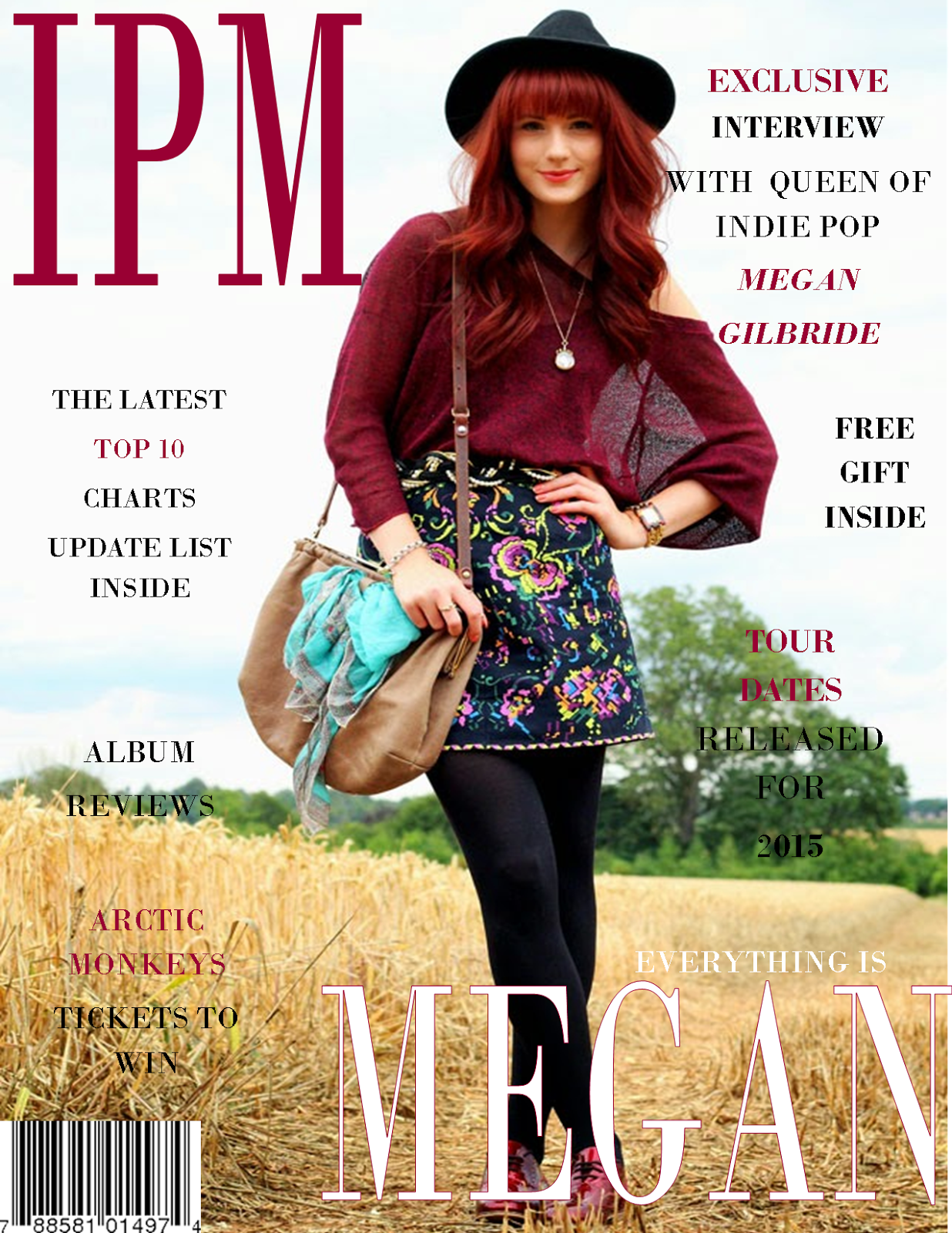
The quality of the magazines contrast enormously. The image quality is different as for my preliminary task I used my phone camera which didn't have much focus. This was a lot easier and more convenient at the time, although it didn't give me that professional photo vibe. Both images were taken outside, however the final cover has more light and stands out more due to the editing of the photo and the use of a professional camera.

In conclusion, overall I fell like my skills of making and analysing magazines have developed over the course. I also feel that my knowledge has greatly expanded in relation to magazine construction and the vast amount of companies which produce magazines daily.

Saturday 7 February 2015

Evaluation 6: What have you learnt about technologies in the process of creating this product?

Taking the photo's
 
When taking my photo's I was lucky enough to use my brother's professional camera which allowed my photo's to have such high quality and resolution. Originally, I thought this was going to be one of the easiest tasks during my coursework, however I was wrong. I had to make sure I held the camera in the exact position to get a mid shot which caused numerous attempts to get it perfect.

 
Downloading the photos

The camera had an SD card which I could very easily slot into my computer at home. I could then use a memory stick to move them onto the school's computers so that I could edit them. By doing this also mean that I would have more than one copy of the photo's in case I lost them.

Editing my photo's

From past experience, I knew that in order to make your photo's look professional you would need to edit them. I used different methods of editing such as adjusting the brightness and contrast, as well as resizing the image and playing around with backgrounds. I came across a good editing website called 'Pixlr' which pretty much done all of these things and more. I tried out a couple of their filters and in particular I liked the range of vintage effects as I felt this best portrayed my genre of indie-pop. 

Main equipment

 I had access to Apple Mac desktops both at school and home, however I found it a lot easier to stick to my 'Sony Vaio Laptop' as I was very familiar with all the programmes and found this so much more effective for my use, as everything I needed to do was available on here and as it being a laptop, I was able to transport it to and from school to get my work done. This also meant I wasn't relying on school laptops or desktops and the chance they may not work or could all be used.

Construction of the magazine, DPS and contents

When creating my actual magazine, I used publisher as it's a programme which I commonly used. I was able to add multiple pages onto publisher, this made it easy for me to stick to a particular house style as I could see them all together. I used this software to add texts onto the images and around the page. This was also great as I was able to undo anything if I had made an error, whereas I know from experience on 'Pixlr' you can't do this without undo everything which resulted in losing a lot of what I had done. I couldn't always rely on this, so now and then I would save my work to make sure I wouldn't lose it. The only downfall using publisher is that you weren't able to upload the document straight onto the blog without having to save it as a picture first, which wasn't too much hassle but it meant having to group all the text and images together.


Friday 6 February 2015

Evaluation 5: How did you attract/address your audience?

There would be no point in constructing a magazine, if you don't know how to attract your target audience into buying it, which is why everything you do, you need to think about 'how is this going to attract my target audience?'. You need to make sure everything in your magazine relates to your genre and audience. For example if a pop magazine, typically loaded with images of 'One Direction' or 'The Vamps', suddenly decide to put a heavy metal rock band on the cover, then this would not attract their audience. After deciding that my target market will be people who share a love for indie pop music, it was then important to plan elements that will attract them and engage them into buying my magazine.
 
One technique I remember being spoken about in class is mode of address. This is where the magazine engages with the audience to make them feel involved in what they're are reading. There are four types of mode of address which include the 1st person, the 3rd person, informal & formal and colloquial & expletive language. In my magazine I thought it was vital to use topic specific words in order to engage to my indie pop audience. In order to do this I needed to use a variety of colloquial & expletive language. I felt because the ages are 15- mid 20's they are relatively young. This in mind, I wanted to make my magazine appeal to the younger generation my using more 'slang' words rather than the Queens English. This was also important to consider in my interview with 'Megan Beth Gilbride'. As she was the artist on my front cover I wanted to write about her and her success in music. I used the quote ' good music doesn't have an expiration date', because I thought this would reach out to my audience and engage them to want to read the article, plus it's a straight forward quote in which everyone can understand.
The images I used were another way to engage with my audience. On the front cover I had my model stand in relaxed pose, looking directly at the camera as I felt this builds the relationship between the magazine and the target audience. On the contents page I added an image of the boy band 'arctic monkey's' because I thought that my magazine front cover didn't portray that it was targeted to both genders, plus the band I chose was also into the indie genre. I feel that my model on the front cover appeals to the ages of my target audience as she is 24. I chose someone slightly older than the majority reading, as most young people have role models older than themselves which is why I felt she would be perfect for my magazine. On my double page spread I kept the model in a different relaxed pose. She has been dressed in more bright colours to reinforce her personality, furthermore the connotations of her smiling enhance the fact she may be a kind and gentle person.
 
When creating my magazine I had to think hard about a Mast head. I came up with a range of indie related words such as 'independent' and 'unique', however I didn't feel like these words were right for my magazine as I wanted something short and memorable.
 
The fonts were also really important when addressing my audience. I learnt that there are two types of fronts. SERIF and SANS SERIF. For my magazine I used Sans Serif front as I thought this looked a lot clearer and complied with my target audience. I felt that using Sans Serif made my magazine look less formal giving it that indie vibe.
  
Another way I engaged my audience was through the contents page. I made sure that the contents page was eye catching to the reader as it is the first page inside the magazine that my audience would see. I kept this page extremely basic by only including 2 images. The text in the context was also very minimal as I wanted the audience to read a little and then feel reluctant to read on inside. Although my main article was focused on Megan Gilbride, I also included other artists such as 'Arctic Monkey's' alongside a photo of them.

I feel like if I could re do anything to improve my magazine, I would firstly add more images regarding other artists as I feel that's one area I lacked on. I would also change the way my model was positioned in the double page spread and have her sitting down to make her seem more casual. However, overall I am really happy with my magazine as whole and feel it related well to my chosen target audience.


Thursday 5 February 2015

Evaluation 4: My target audience


Evaluation 3: What media institution might distribute your magazine and why?


I decided that Bauer is the best company to publish my magazine with. I did a lot of research before hand on publishers and found that Bauer was most commonly talked about and seemed very successful around Europe. Bauer has a range of magazine covering numerous genres involving music or even home baking. When constructing my magazine I was always attracted to the magazine 'Q' and this magazine is what gave me a lot of inspiration for my creating. When I found out that Bauer published 'Q', this made much sense to chose Bauer.
As well as Bauer, I wanted to have more knowledge of other magazine publishers so that I wasn't just being narrow minded. I found Warner Group Publications, IPC Media and Blaze Publishing. From research into these 3 in particular, I found IPC in particular was similar to Bauer as it published a wide range of magazines, however not as many as Bauer. The other two contrasted from IPC and Bauer as they are independent company's meaning they are not as widespread. This means that they won't have as much money to spend and therefore are not able to publish big magazines such as 'Q' or 'NME'. This is the main reason why I didn't choose either of the other publishers as I felt in order for my magazine to be successful, it would need a lot of investment.


Another reason I decided to choose Bauer was because I found that they sold many more 'acoustic' music magazines than other companies such as IPC Media, which I find is most important as my chosen genre is indie-pop, which is quite a niche market, and knowing Bauer sell these type of magazines gives me hope that my magazine will also be successful.
 
Moreover, I had to think about the type of locations I would want to sell my magazine. I was torn between selling it in supermarkets such as Tesco and Asda or book stores such as WHSmiths. To start with I was very sure of choosing a big, well known supermarket as my logic was that selling them here would give them more recognition, as hundreds of people shop in these type stores everyday for groceries, and may be walking by the magazine stands and see my magazine, whereas not as many go out of there way to go into a book store. However I then thought selling my magazine in a specific place made for magazines and books are obviously appealing to that certain target market. I finally decided that I would go with selling my magazine at WHSmiths because although supermarkets get thriving business all year round, people are more interested in buying their weekly food than buying a magazine. Where as businesses like WHSmiths still get customers all year round, but are specifically after books, magazines or even stationary. Plus when going into WHSmiths, they sell a huge range of magazines with a variety of genres which is why I decided to choose this place.


Evaluation 2: How does your media product represent particular social groups?


Wednesday 4 February 2015

Evaluation 1: In what ways does your media product use, develop or challenge forms and conventions of real media product?


As you can see here, I based my main idea of my double page spread on the magazine Q. As I mentioned in previous posts, I love the layout of Q and how it has great structure yet it also very creative and minimal. Q magazine also helped me to design my front cover and contents page with it's layout of images and text.
I felt keeping a house style running throughout my magazine was important so
that the reader gets familiar with the magazine and can identify it on a shelf without having to read the mast head.
I have constructed my double page spread so that it follows similar conventions of a typical music magazine. In comparison to Q magazine, there is the main image of the artist/band on one side of the page, and then text in two columns on the other side. By following similar music magazines, gave me ideas and enabled me to pick up the typical conventions, therefore making it easier for me to design my own magazine. As you may of spotted immediately, Q magazine gave me the inspiration for using a large letter behind the text. If it wasn't obvious already, the letter represents the artists/bands first name which in this case, the 'M' represented 'Megan'. I felt this was quite a cool, edgy idea which fitted in with my independent genre, as well as reinforcing the importance of my artist. I also felt doing this gave plain, simple text a more fun and creative look, therefore making the audience want to read it. In the Q magazine demonstrated above, I noticed how there was some text on the image, which is why I thought it would be unique to input a quote next to the model, to reinforce the artists personality and give the audience something extra to read. This was one reason for positioning the quote here, but the second reason was due to me originally placing a smaller picture on the bottom left, meaning there was an empty space left on the other side of her. I felt placing the quote here would complete the double page spread and make everything intertwine very neatly.
When editing the photo I was very keen on sticking to the 'vintage' style theme as seen on the front cover and contents. As the images are very similar to each other, it wasn't too hard to maintain this. I also thought by sticking to the same fonts and colours would help me to achieve the look I wanted and make it look very structured and professional throughout the magazine.


As you can probably see from above, the magazine 'Q' had once again helped me to design the layout of my contents page. I noticed how 'Q' had stuck to their red white and black house style by highlighting the sub heading and page numbers in red, and then putting the rest of the text in black. I really liked this idea as I felt it looked really controlled and precise, which is why I used the models sweater to contrast with the page number and sub headings, creating a structured link of importance between the two. I found this also makes the contents page easier to read and navigate around. However, my contents page isn't exactly the same as 'Q' as I found there was quite a large amount of text on their contents which I wasn't keen on having, as I found this made the page look a little cramped and clustered, therefore I chose a few major headings and surrounded them by larger images, making the contents more boisterous.
As I felt that my magazine was slightly more bias for girls, I decided to add the image of a boy band... in this case it was 'arctic monkeys', as they were a familiar indie-rock band which both males and females admired in this genre of music.
I chose to continue using the colour burgundy so that it would create a flow throughout my magazine, as the colour was used on the front cover to highlight the mast head and topic headings, as well as being used on the double page spread when highlighting the page number and artists name.