Looking back at my preliminary task, it is evident that there are certain conventions that are non existent.
When first starting, I made a school magazine cover which obviously isn't as good as my final front cover, as I was a novice to using programmes such as pixlr, which helped me gain skills and techniques in order to make a successful magazine. However, I do believe this magazine has the basic key conventions which you would expect to find on most magazines. For my final front cover, I arranged to take a long shot of several pupils. I felt that choosing my models were important, as I wanted them to represent the school, which is why I decided to pick those in uniform standing directly outside the school main entrance. I made sure that the school logo was present in the image, however looking back at the cover, I would probably think about repositioning the mast head as the title and image contrast slightly and make it look unprofessional. Due to the target audience being aged between 12-18, I thought keeping it basic and using more images than writing would be far more effective and creative... which is why I used 3 smaller images at the bottom to demonstrate some of the short snippets of information.
I hadn't really learnt much about house style and themes for magazines, which is why not everything is clear, however I knew that by sticking to the school colour scheme of red, white and grey/black, this would give the audience a greater recognition of the school. The house style was something I has just learnt therefore I really wanted to master it. The main thing I would improve if I had to re-construct this magazine again would be the image. Following the rule of thirds I feel this image is too large and too complex. At that time I chose a long shot so that I was able to fit the school logo and pupils all in the same picture, however I feel this looks very messy, and so I would probably use just one pupil, and take a close up/ mid shot more centre of the page. Due to the pupils being positioned on the right third of the page, this limited me to where I could place my information.
Personally I feel that during the construction and research about magazines, my skills have improved massively. From researching different genres of music magazines and carrying out textual analysis of different magazine styles it has opened me up to a whole new development of skills and understandings of magazines. I have learnt to work on pixlr and edit photo's exactly how I want them to look, which is something I had never been opened up too. I am now aware of the styles of writing magazines use and why, as well the need for house styles and colour schemes. The spacing of images and text has also become clear to me and I have been able to create mast heads and overlay images which I have learnt can really make a difference to your magazine.
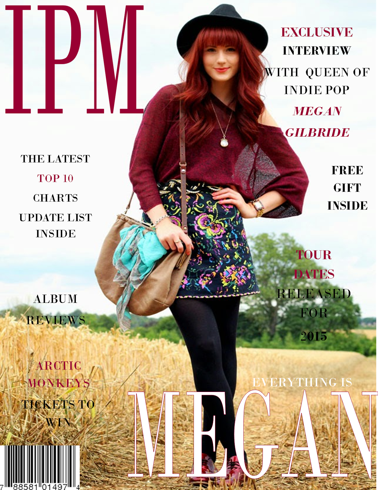
As you can see in this image I placed the masthead to the left of the model. Originally I had in mind placing the masthead behind the models head as this was a popular technique used by magazines, however due to the magazine name being quite short, I felt this wouldn't look right, which is when I used the magazine 'Q's' idea to place it in the corner. Comparing this to my preliminary task, I place the masthead in the centre of the page and places the image below it. was unable to do that therefore I just placed it above the image. I felt like placing the title next to the model rather than above her made the cover come together nicely. I thought that this definitely improved the look of my magazine. I felt that I kept a running house-style throughout my magazine which reflected both genders of my target market (male and female) as the colours were burgundy, black and white which are all unisex. I also included minor finishing touches such as barcodes, which I would never of thought of in my preliminary task, however due to research into other magazines, I was able to make these adaptations to my final cover to add that slight edge of professionalism.
The quality of the magazines contrast enormously. The image quality is different as for my preliminary task I used my phone camera which didn't have much focus. This was a lot easier and more convenient at the time, although it didn't give me that professional photo vibe. Both images were taken outside, however the final cover has more light and stands out more due to the editing of the photo and the use of a professional camera.
In conclusion, overall I fell like my skills of making and analysing magazines have developed over the course. I also feel that my knowledge has greatly expanded in relation to magazine construction and the vast amount of companies which produce magazines daily.

